For those with a subscription, the experience is as seamless as can be. With just a swipe, Trenara's dashboard becomes almost like Tinder.
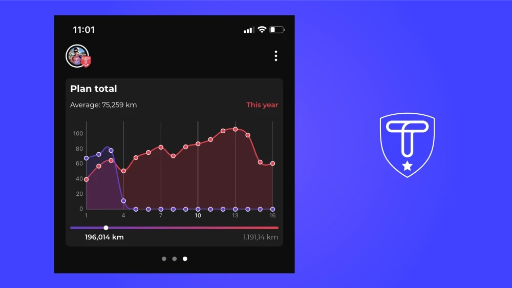
The dashboard stats are divided into three parts. The first graph gives you a weekly overview: when are your workouts scheduled, and how many kilometers are you covering? At the bottom, a progress bar simply tracks your progress.
The second graph provides further insight into your journey towards your goal: we project the upcoming weeks, allowing you to see the gradual increase in kilometers and the inclusion of rest weeks.
For those with Peak Pro, tapping on such a graph reveals even more statistics: average pace of all your workouts, total running time, total exercise time, total kilometers,... you name it!